
Direct Answer: Dim refers to brightness level. Warm refers to color temperature. They’re controlled separately, and confusing the two is the most common reason a room never looks quite right.
You dim the lights for dinner and the room still feels harsh. Or you swap in a ‘warm’ bulb and the space feels muddy and dim even with everything turned up. Both situations are frustrating — and both come from mixing up two things that sound related but work completely independently: brightness and color temperature.
This confusion shows up constantly in homes across Carmel-by-the-Sea, Pacific Grove, and Pebble Beach — especially during kitchen remodels and bathroom renovations, where getting the light right actually affects how much you enjoy the finished space.
Understanding how these two qualities interact — and how to control each one — is what separates a room that looks good in photos from a room that feels right to live in every day.
What ‘Dim’ Actually Means
Dimming is about light output — how many lumens are reaching your walls, countertops, and faces. When you use a dimmer switch, you’re reducing wattage draw, which drops the lumen output of the bulb.
A 60-watt equivalent LED at full power puts out roughly 800 lumens. Drop it to 50% on a dimmer and you’re getting somewhere around 400 lumens — enough to set a mood, but not enough to read by comfortably.
Here’s where most people go wrong: they assume dimming a light makes it feel warmer. With old incandescent bulbs, that was actually true — they’d shift toward amber as they dimmed. Most LED bulbs don’t do that unless they’re specifically designed to. A 4000K LED at 50% is just a dimmer 4000K — still cool, just quieter.
If you want dimming to feel warm, you need a bulb that’s already warm — or one with built-in warm-dim technology, which mimics the incandescent shift as you lower the light level. These exist and work well, but you have to know to ask for them.
What ‘Warm’ Actually Means — and How to Read the Numbers
Color temperature is measured in Kelvins (K). The lower the number, the warmer the light looks. The higher the number, the cooler and more clinical it feels.
Think of it this way:
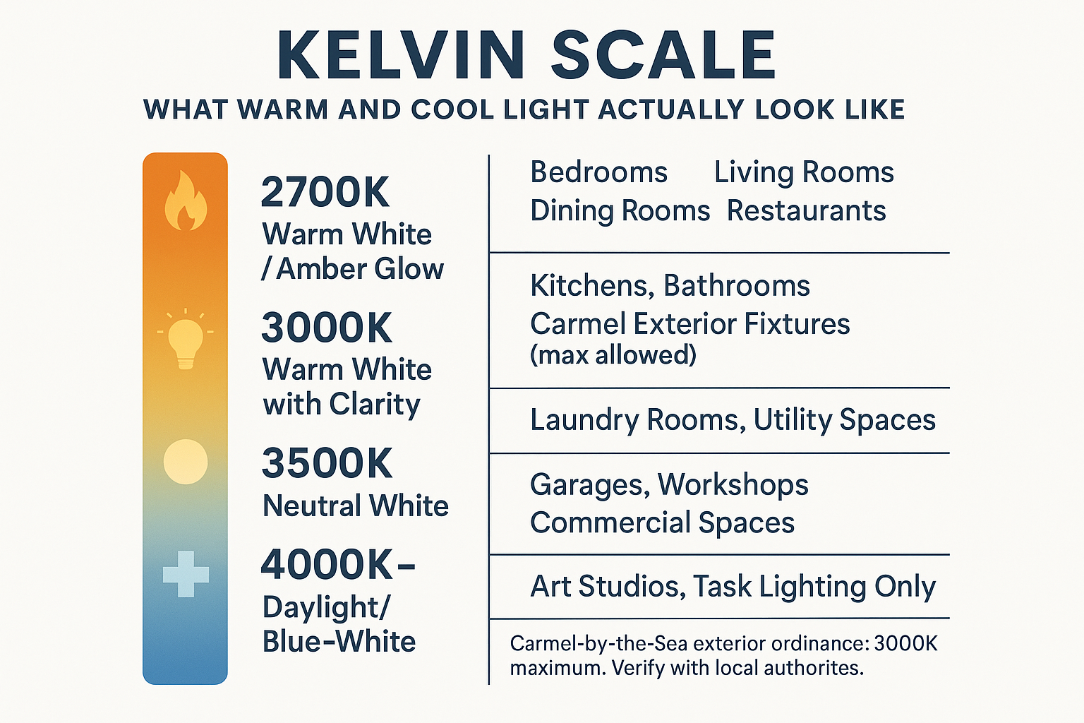
- 2700K — soft, amber, candlelight-adjacent; great for living rooms, bedrooms, dining spaces
- 3000K — warm white with a little more clarity; works well in kitchens, bathrooms, and task areas
- 3500K — neutral white; common in commercial spaces, feels less residential
- 4000K and above — cool, crisp, blue-leaning; common in offices and garages
For most homes on the Monterey Peninsula, 2700K to 3000K is the sweet spot. Carmel-by-the-Sea’s exterior lighting ordinance actually caps residential outdoor fixtures at 3000K for this exact reason — cooler light disrupts the town’s visual character and affects local wildlife. That same logic applies indoors: cooler light makes spaces feel less like homes.
When you’re standing in a lighting showroom comparing fixtures, the color temperature of the display matters enormously. What to look for in a local lighting supplier goes into this in more detail — but the short version is that seeing a fixture lit under the right temperature is what helps you make the right call.
Color Temperature at a Glance
This quick reference shows how Kelvin ranges map to real-world lighting situations — and which rooms each range works best in.
Why Both Controls Matter — and How to Think About Them Together
The rooms that feel the best are almost never set to one brightness level with one color temperature. They use both controls intentionally — the way a good restaurant does.
If you’ve ever wondered how restaurants make their lighting feel so inviting, this is most of the answer: they choose a warm color temperature (usually 2700K to 3000K), then dim the ambient fixtures down to about 30–50% output while keeping task or accent sources a bit brighter. The result is visual contrast that reads as warmth and intimacy.
You can do the same thing at home with three moves:
- Choose fixtures with warm-rated bulbs (2700K or 3000K) before you ever touch a dimmer
- Install dimmers on ambient circuits — the overhead fixtures that set the room’s overall tone
- Keep accent and task lighting slightly brighter than ambient to create depth
A living room where the overhead pendant is dimmed to 40% but the table lamp is at full output feels layered, not dark. A room where everything is the same brightness — even at low levels — just feels flat.
This is also why buying a bulb online without seeing it in a lit environment is risky. A bulb labeled 2700K from one manufacturer can look noticeably different from another brand’s 2700K. The Kelvin rating is a standard, but the actual light output and color rendering vary. Color Rendering Index — the CRI number — is the other rating worth paying attention to, and it’s often missing from big-box labels entirely.
Dim vs. Warm: Side-by-Side Reference
These two qualities are often conflated, but they’re controlled completely differently. Use this as a quick reference when making fixture and bulb decisions.
| Quality | What It Measures | How You Control It | Common Mistake |
|---|---|---|---|
| Dim (Brightness) | Lumen output — how much light reaches a surface | Dimmer switch, bulb wattage, fixture count | Assuming dimming makes light look warmer — it usually doesn’t with LEDs |
| Warm (Color Temperature) | Kelvin rating — the hue of the light itself | Bulb or fixture selection at time of purchase | Buying a high-Kelvin bulb expecting it to feel cozy at low brightness |
| Warm-Dim Technology | Both — brightness and color temperature shift together | Built into specific LED bulbs; must be specified at purchase | Not asking for it; missing the incandescent-style warmth shift entirely |
| CRI (Color Rendering) | How accurately light shows true colors | Bulb spec — look for CRI 90+ for living spaces | Ignoring CRI entirely; warm-looking light can still wash out skin tones and finishes |
Where This Goes Wrong Most Often: Kitchens and Bathrooms
These two rooms are where the dim-vs.-warm confusion causes the most visible problems — because both rooms have real functional lighting needs alongside aesthetic ones.
In kitchens, many homeowners choose 4000K or 5000K for the recessed cans because they want ‘good task lighting.’ And they’re right that brighter, cooler light helps when you’re prepping food. But when those same cans are the only light source in the room, the kitchen looks like a dentist’s office after dinner.
The fix isn’t changing the task lights — it’s adding warmer accent or ambient fixtures (pendants over an island, under-cabinet strips at 2700K) so you can turn down the recessed cans when you’re not actively cooking. Lighting your coastal kitchen covers this layered approach in much more detail.
In bathrooms, the opposite problem is common: people choose 2700K for the vanity because it sounds flattering, then wonder why their makeup looks off or why the space feels dim and yellow. Bathrooms generally need 3000K — warm enough to feel residential, bright enough for accurate grooming. And the fixture position matters just as much as the bulb. A single overhead source creates shadows that no Kelvin rating can fix.
For bathroom vanity lighting specifically, side-mounted fixtures at face height give far more even, flattering light than overhead-only setups — regardless of color temperature.
Frequently Asked Questions About Dim vs. Warm Lighting
Can I make my existing LED bulbs look warmer just by dimming them?
Usually no. Standard LEDs hold their color temperature across the dimming range — a 4000K LED at 20% output is still 4000K, just quieter. To get the warm shift that incandescent bulbs produced when dimmed, you need bulbs specifically labeled ‘warm-dim’ or ‘candle-dim.’ They’re available, but you have to ask for them by name.
What’s the right color temperature for a living room on the Monterey Peninsula?
2700K is the standard recommendation for living rooms. It’s warm enough to feel relaxed without looking orange. Pair it with a dimmer on the overhead fixture and a table lamp or two at the same temperature, and you’ll have a room that adjusts well from afternoon to evening.
Does color temperature matter for outdoor fixtures in Carmel?
It matters a lot. Carmel-by-the-Sea’s exterior lighting ordinance caps residential outdoor fixtures at 3000K maximum and restricts lumen output. Fixtures above that range don’t comply — and the ordinance applies to new installations and replacements. If you’re updating outdoor lighting in Carmel, verify current requirements with the city or your contractor before purchasing. More detail on Carmel’s exterior lighting rules is worth a read before you buy anything.
What does CRI have to do with warm vs. cool light?
CRI (Color Rendering Index) measures how accurately a light source shows the true colors of objects around it. A bulb can be 2700K and warm-looking but still have a low CRI — which means skin tones look off, paint colors look dull, and wood finishes look flat. For living spaces, look for CRI 90 or higher. Warm color temperature and high CRI together are what make a room look genuinely good.
I have recessed cans throughout my house and they all feel too bright and cold. What’s the most practical fix?
Two options. First, swap the bulbs for 2700K or 3000K warm-dim LEDs — this is the cheapest fix and often makes a real difference. Second, add dimmer switches if you don’t already have them. Many older homes on the Peninsula were wired without dimmers on the main living areas. Both changes together can transform how a room feels without touching a single fixture.
Want to See the Difference in Person?
Describing color temperature in an article only goes so far — the real way to understand it is to stand in front of two fixtures side by side and see the difference yourself. Greg and Tammy at The Home Lighter keep the showroom at 2034 Sunset Drive in Pacific Grove lit with working examples across multiple color temperatures and dimming levels, so you can see exactly what 2700K looks like next to 3000K before you commit to anything. Walk-ins are always welcome, or call ahead at (831) 655-5500 if you’re working through a larger project and want to set aside time.